Typo Lyon: The Shift
Description︎︎︎
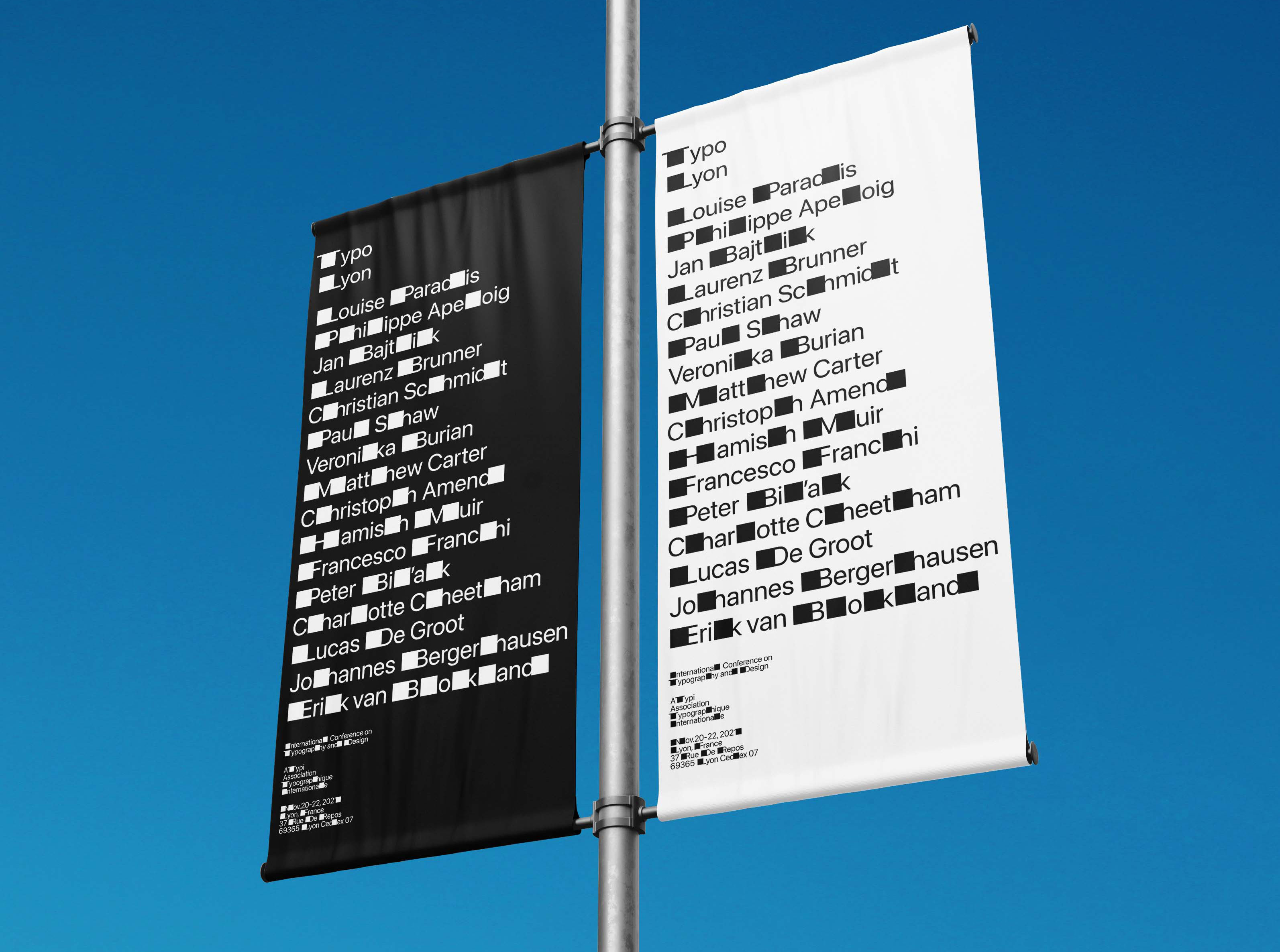
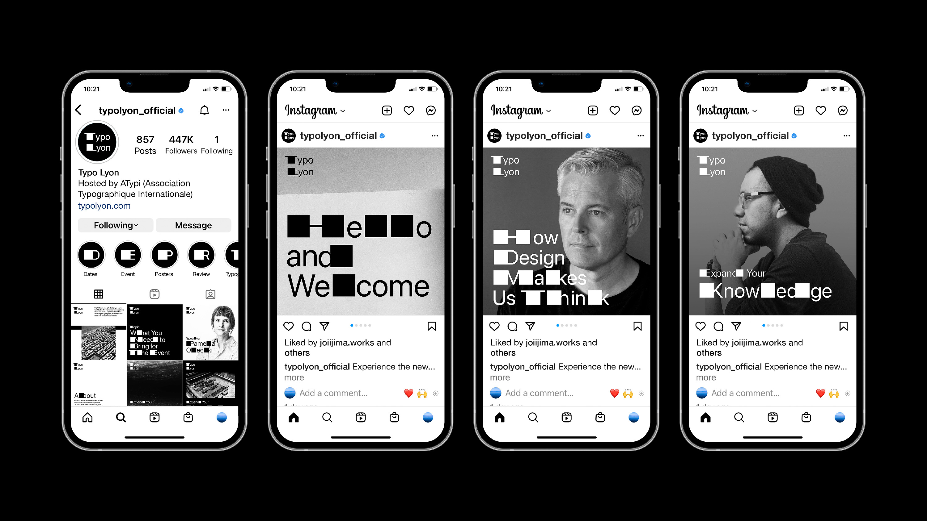
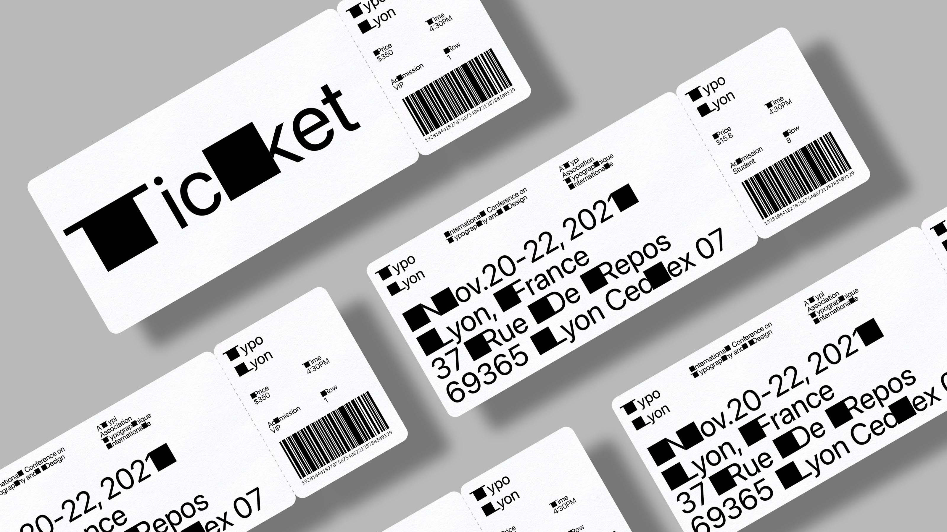
A branding project for Typo Lyon, an international conference on typography and design hosted by ATypi. The logo extends the stems of T and L and a typographic system named "The Shift" expands the stems of all letters in the alphabet. This typographic system not only reflects the anatomy of the typography itself but also is used for the name of the experience which visitors can "expand" and "shift" their knowledge of typography. Different letter combinations create unexpected shifts throughout the identity system, providing dynamic visuals at the conference.


