88rising Rebrand
Project︎︎︎
Brand Identity
Mentors︎︎︎
Ivan Cruz, Shirleen Lavalais
Description︎︎︎
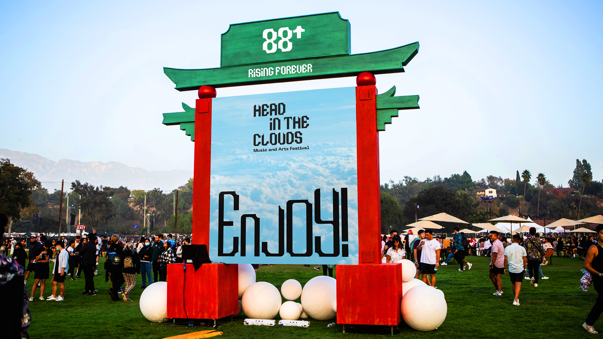
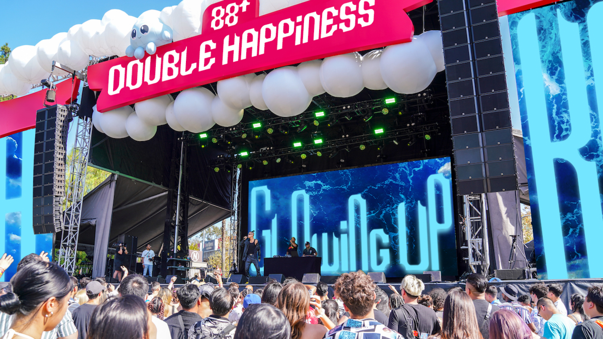
This is a rebrand project for 88rising. 88rising is a media collective and record label that promotes Asian talent and culture. They host a music festival called Head in the Clouds Festival, featuring both in-label and external artists.
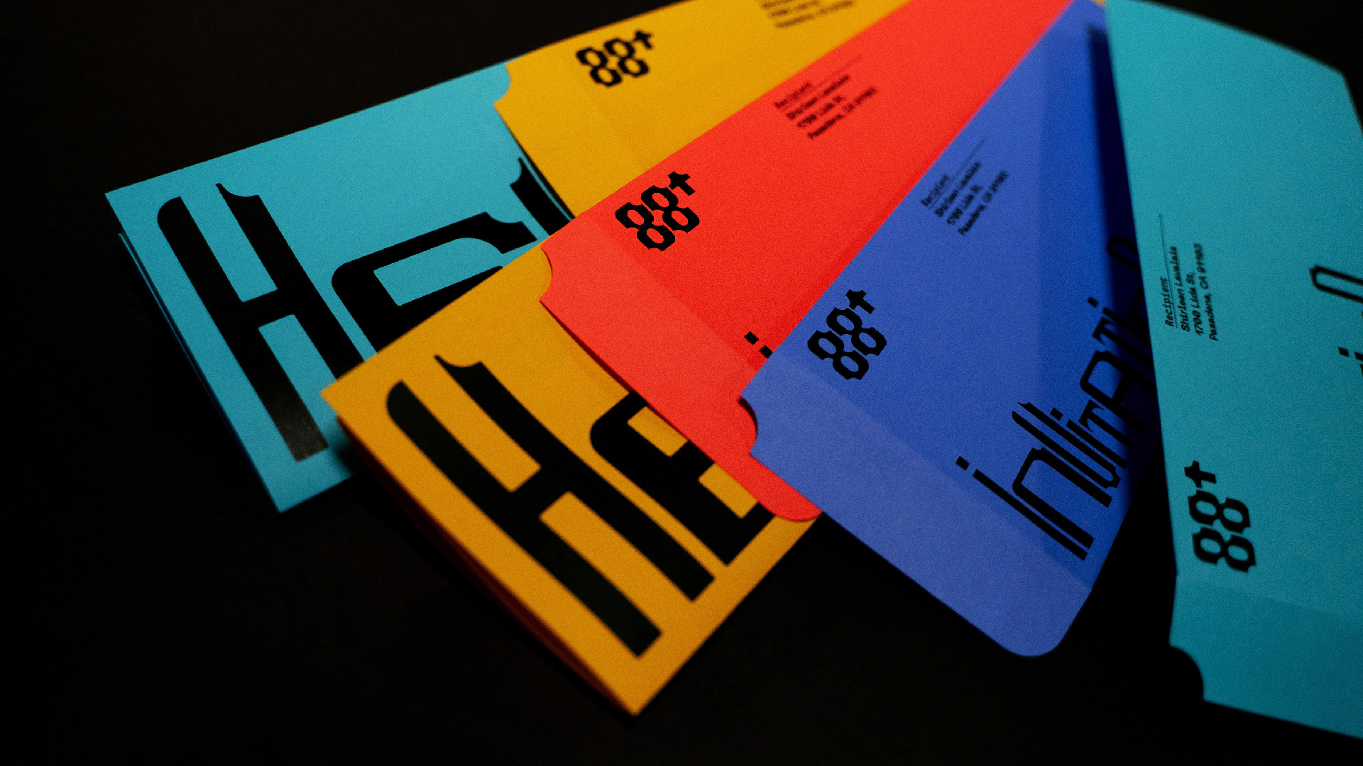
The number 88 has a meaning of double happiness in Chinese culture, and the new branding aims to establish a brand that brings fortune and well-being to its audience and artists. The corner notches in the logo draw inspiration from the Chinese phrase "Bamian Laicai," featuring eight sides representing wealth, which means "wealth coming in from all corners of the world." The corner notches also symbolize impermanence and 88rising’s ongoing commitment to progress. The original logo typeface, "Rising Super," embodies growth and inclusivity with its negative space in the corner, allowing both the artists and the audience to contribute to the completion of 88rising. The typography is dynamic and versatile, rising to elevate important voices and break cultural boundaries. It has a sound-reactive feature to enhance the performance energy at the Head in the Clouds Festival.